THE MAKING OF A HOME
Content made for Jotun LADY
Six months ago I was pinching my arm standing in my new kitchen in the apartment I just moved into. It was filled with boxes from the moving, there were still work left both for electricians, plumbers, painters.. nevertheless I was preparing for New Years dinner and felt everything was a bit unreal. Not that renovation projects was new to me, if you have been following me since I started sharing my projects online you already know. But it was the first time I did it all by myself, for me, and this new home felt so familiar – like it had already been in my imagination for years. It felt like coming home. With all the charm that comes with an apartment from 1896, a view to one of the nicest squares here in Grünerløkka and maybe most importantly, super close to my kids school and with a huge green backyard for them to play in.
So what did I do during three months of renovation? I started out redesigning the layout of the apartment. Originally it only had one bedroom and in order to have one more I needed to make a whole new kitchen (which makes perfectly sense now that its done), redesign the hallway and how you enter the apartment and try to find the original ornaments and details that I was hoping still was underneath layers of floors, ceilings and new walls. As for so many old apartments in Oslo this one also unfortunately was ripped for original details during the 1980´s when bathrooms and toilets were installed and the general quality of homes were improved in this area of the city. It seems late right? The workers areas were not prioritized at all, but no areas like that left in town now. Just expensive, hip and family friendly areas. Doing renovations like this is like digging into history where you find so many traces from life lived many years ago.
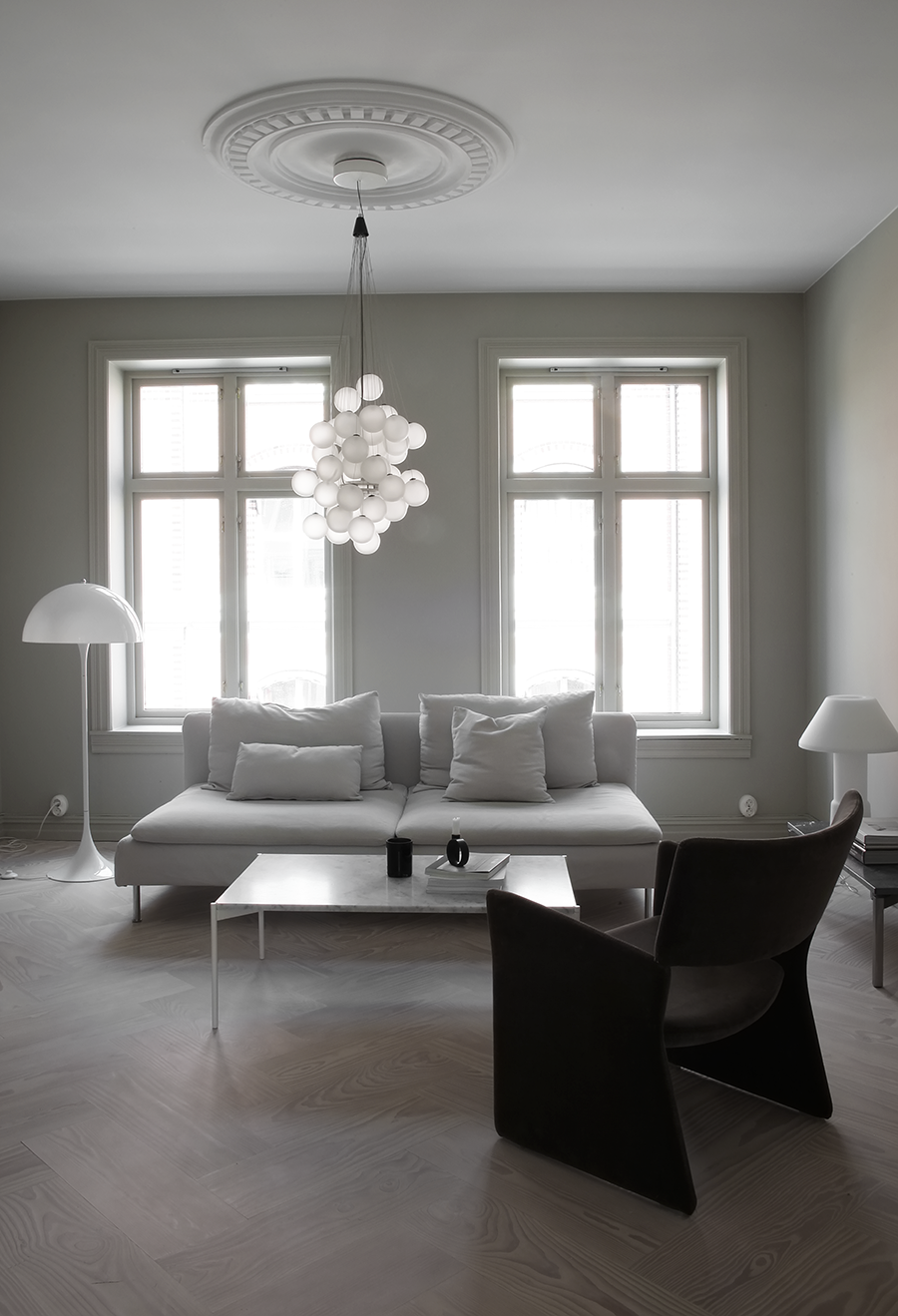
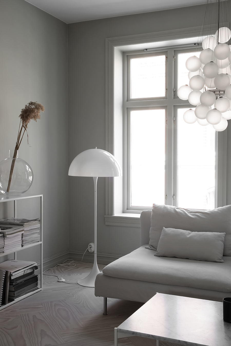
After discovering almost none of the original details was left in my apartment I decided to recreate some of them. To me it was the obvious thing to do, I wanted it to look like an modernized apartment from 1896. Instead of the typical old herringbone floors I chose one from Dinesen in a larger dimension. Without seeing any examples of the exact floor before ordering it I was so excited to see how it would turn out. Pretty much couldn’t be more happy with my choice of floors. The fir is treated with lye and white oil and by time (and cleaning) it will lighten even a bit more.
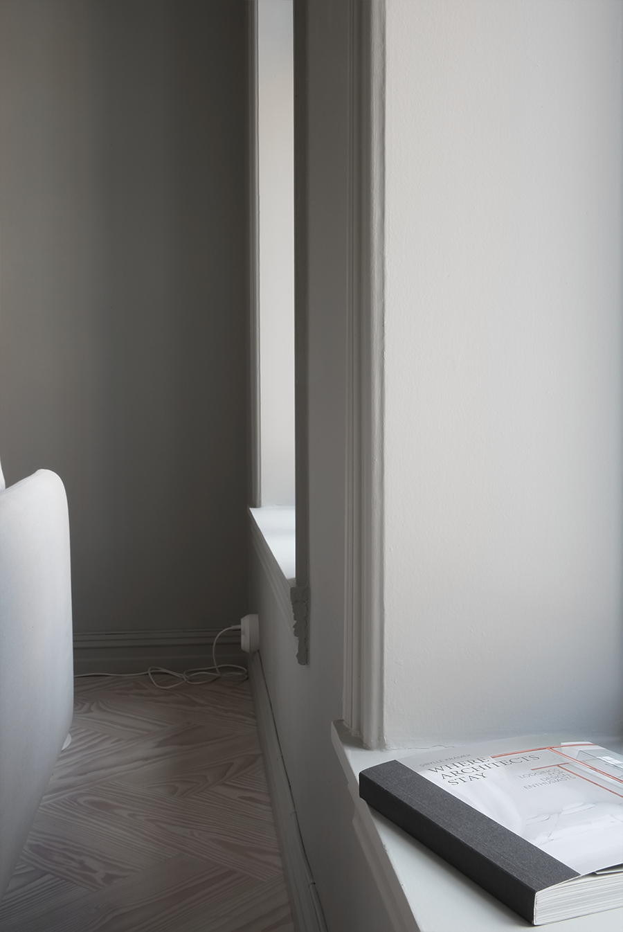
To achieve the smooth and even surface I wanted all walls, both new and old were spackled and painted. For the living room I chose the color LADY 1016 Blek Sand both for skirting boards and walls. LADY Pure Color for walls and LADY Supreme Finish for skirting boards. Recently I also painted the window frames too in the same color. I think it looks so nice when everything has the same color instead of dividing the wall with white skirting boards or window frames. Across the street from my living room its an red brick building and choosing the color here I needed to take it into consideration. When the sun hits the brick walls in the afternoon it reflects so much into my home and to not emphasize it the wall color has no red in it. Its still a warm color, this is a north facing room after all. Important factors to consider when you choose colors for your home. The ceiling and rosettes is painted in LADY 9918 Klassisk Hvit, Lady Perfection paint for ceilings.
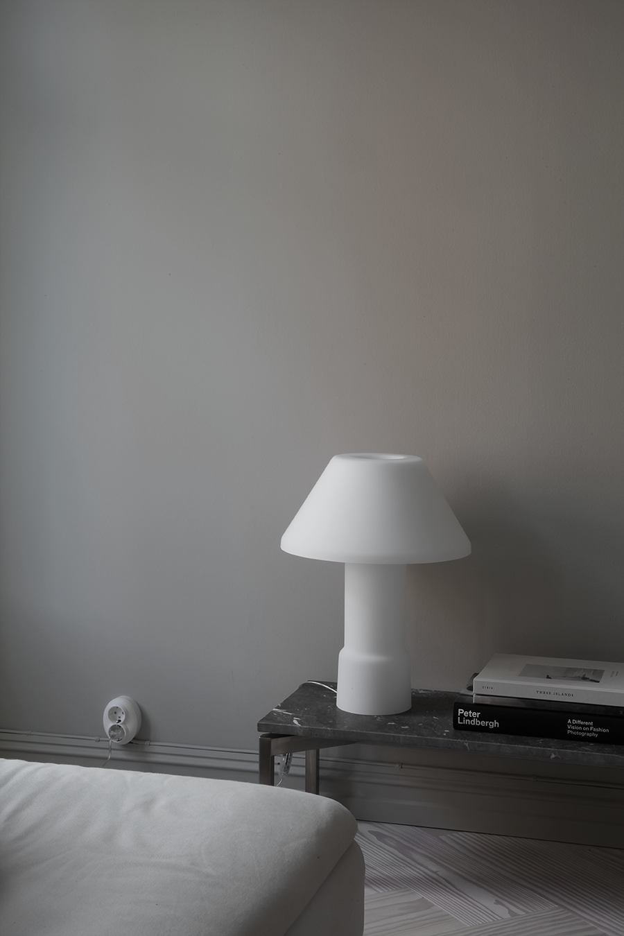
When I started the renovation I thought it was possible to not do the electricity, in order to stick to a tight budget.. Well, it also needed to be fixed but at least I got to choose new sockets and switches who fits the style of the apartment.
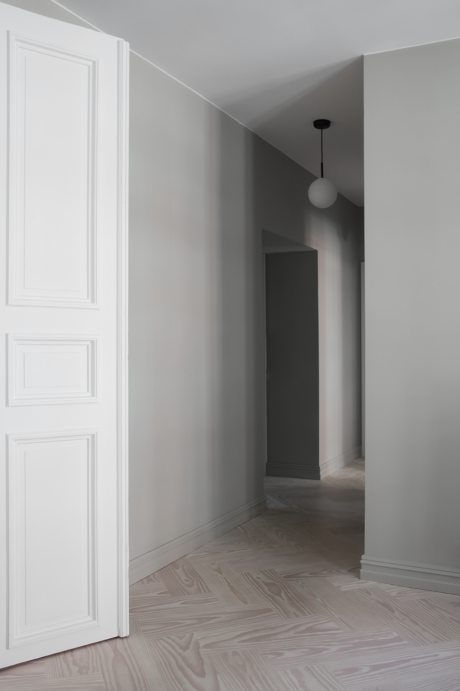
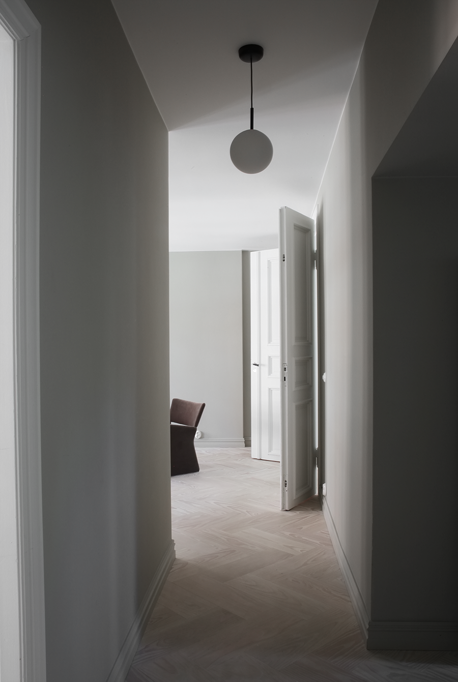
To the left the entrance and the small bedroom, to the right my bedroom and straight the bathroom.
Double doors between rooms in old apartments is one of the most beautiful details I know. No original ones in my apartment but I found some really nice ones from another old apartment for sale at Gamle Trehus here in Oslo (good tip if you’re looking for doors or other architectural details during renovations). Also see my very not straight ceilings in the photo underneath.. instead of straighten everything I kept it like this to maintain the height.
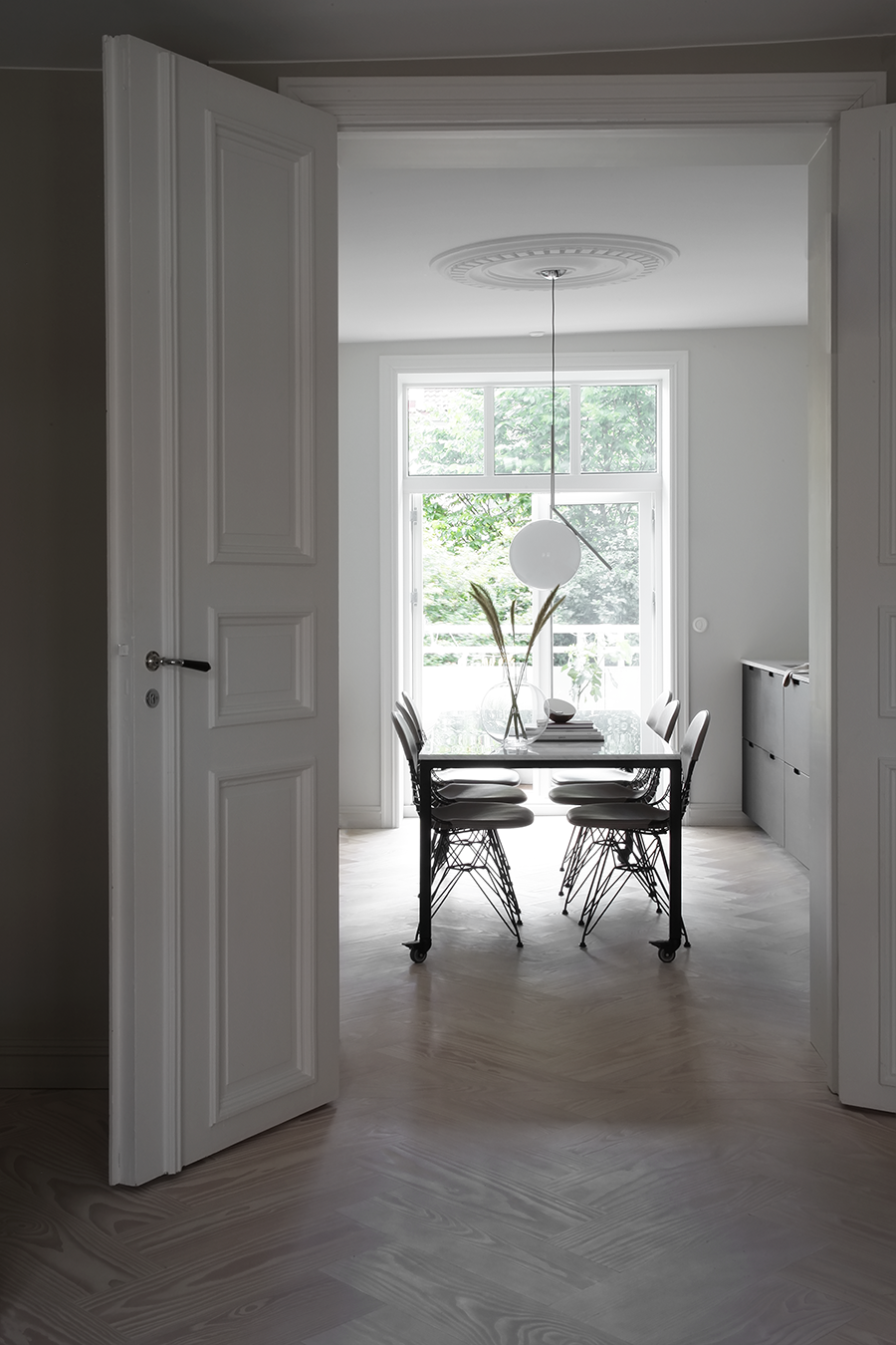
Nothing is straight in old apartments. Newly installed doors are, but I left the ceiling looking like this.
Light is flowing between the kitchen and the living room from big windows on each side. A south facing balcony outside of the kitchen is the best feature during summer. In the kitchen I chose a lighter color for the walls, LADY 1928 Sommersne to go with the dark bamboo fronts on the kitchen. In this room I also have my small work space. The color is warm grey and looks great if you want a tiny bit of color and not white for the walls. This room used to be the dining room, but no need to keep it like that when I could fit both the kitchen and a dining area into it. And have the extra bedroom where the kitchen was before.
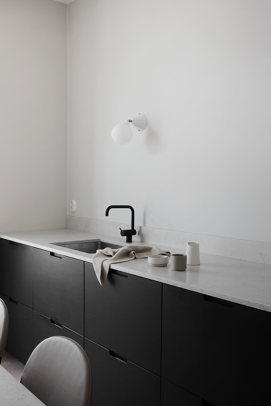
Kitchen from Ikea, fronts in bamboo from Ask og Eng, worktop in Silestone from Eassystone, faucet from Vola and wall lamp from Areti/Oslo Deco.
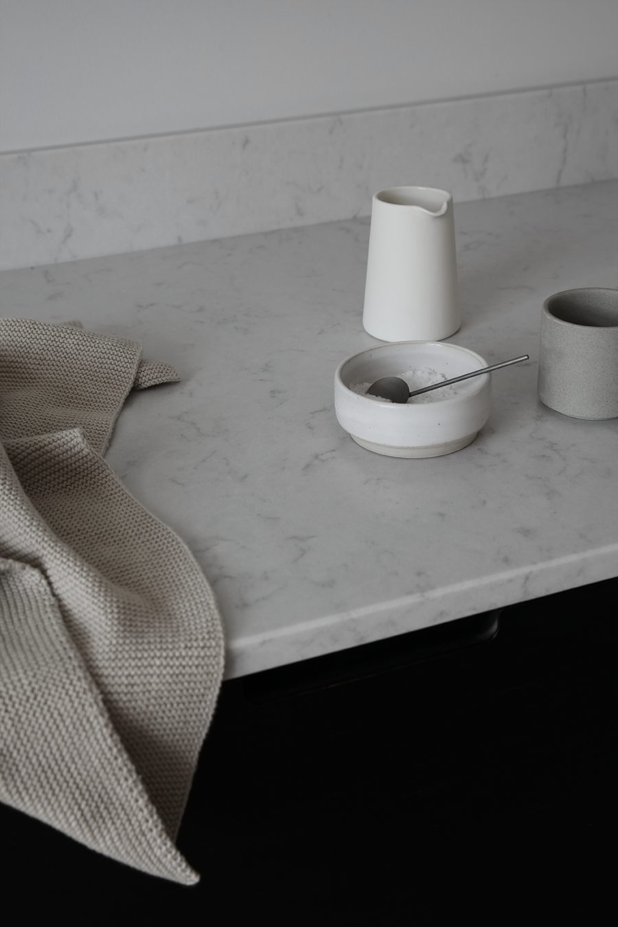
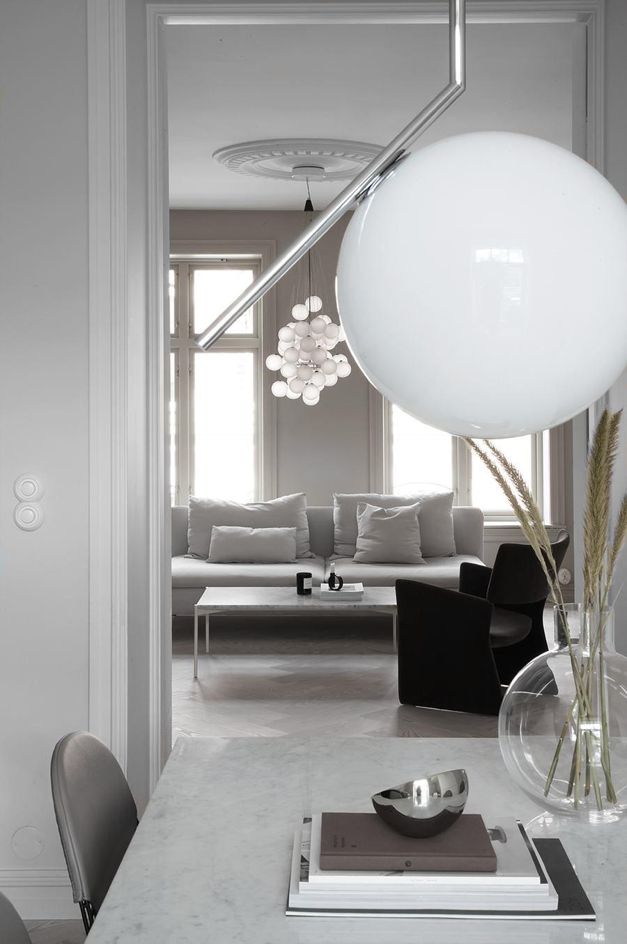
Photography © Elisabeth Heier
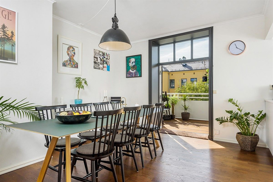
Dining room before renovations, now the kitchen.
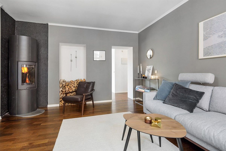
Living room before. View to where the double doors and kitchen is now.

